At first glance, Hyundai’s logo looks like a simple slanted “H.” But look closer, and you’ll see much more. That forward-leaning letter isn’t just the brand’s initial—it’s a stylised handshake between Hyundai and its customers, wrapped in an oval that represents the brand’s global reach. It’s clever, human, and symbolic of Hyundai’s rise from a humble Korean automaker to a worldwide innovator.
[qi_quick_summary]
From Plain Text to Global Symbol
The name “Hyundai” (현대) means modernity in Korean. Back in 1947, when Hyundai Engineering & Construction started, there was no logo at all—just the name. By 1967, with the launch of Hyundai Motor Company, the brand introduced a plain wordmark: HYUNDAI in bold uppercase letters. Practical, no-frills, and reliable—just like the cars it made for Korea’s growing market.
But as Hyundai’s ambitions grew, so did its need for a stronger identity.
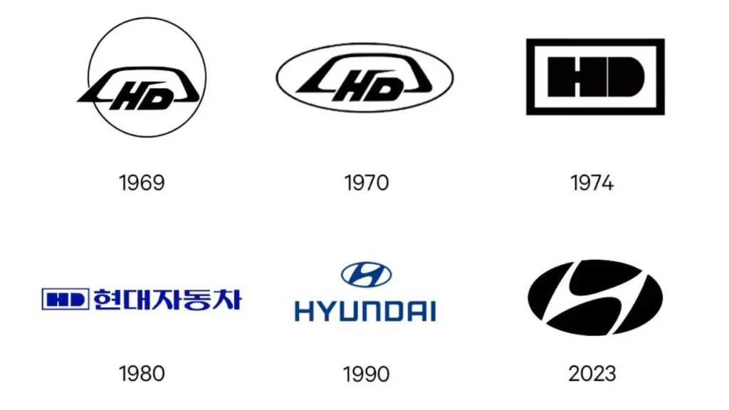
The Logo Through Time

- 1968–1975: The early Ford partnership gave Hyundai a blocky wordmark, simple but purposeful. With the launch of the Pony in 1975—the first Korean car for export—the letters thickened, showing more confidence.
- 1979–1989: The wordmark grew bolder and sharper, preparing Hyundai for global expansion. In 1986, the Excel hit the U.S. market still carrying the plain wordmark.
- 1992: The real game-changer—the slanted “H” inside an oval—made its debut. Suddenly, Hyundai had more than a name; it had a story.
- 1995–1999: The emblem rolled out worldwide and gained a metallic chrome finish, giving it a premium edge.
- 2000s–2010s: From brochures with 3D shading to flat digital versions online, the logo adapted with the times.
- 2021–today: A clean, flat 2D emblem dominates digital use, while car badges keep their polished metal look.
What the Logo Really Means
- The Slanted “H”: Two people shaking hands—Hyundai and its customers.
- The Oval: Encircles the handshake, showing Hyundai’s global ambitions.
- The Tilt: Forward movement, innovation, progress.
- Colours:
- Blue = Trust and reliability.
- Silver/Chrome = Technology and sophistication.
- Flat 2D = Simplicity for the digital age.
Hyundai in the EV Era
As Hyundai moves into electrification, the logo continues to evolve in presentation, not meaning.
- The Ioniq sub-brand—launched in 2020—still wears the oval “H” proudly, but its branding feels futuristic.
- Some EVs like the Ioniq 5 and Ioniq 6 feature backlit logos, glowing like a tech statement on the road.
- On screens, Hyundai prefers the flat 2D design, crisp and minimal.
- The pixel-inspired design language of Ioniq connects the brand’s digital future to its visual identity.
Hidden Meanings & Fun Twists
Hyundai has always enjoyed adding subtle layers to its branding:
- The Handshake: Human connection, trust, and satisfaction.
- The Global Oval: A symbol of unity and worldwide vision.
- Morse Code Easter Egg: In the Ioniq 5, the steering wheel, instead of the “H” badge, shows four small dots. These represent Morse code for “H,” linking subtly to the Hyundai initial.
More Than a Logo—A Legacy

Hyundai’s badge is more than a car emblem. It’s a symbol of its journey—from a budget-friendly local automaker to a global powerhouse in mobility innovation. The handshake-inspired “H” tells the story of trust and partnership, while modern tweaks like glowing EV logos and Morse code touches keep it fresh for a new generation.
Find the best Hyundai cars for sale in the UAE.
Stay tuned to UAE’s most popular auto blog for more information about the latest happenings in all of the Emirates.
FAQs
What does the Hyundai logo mean?
The slanted “H” represents two people shaking hands—a company representative and a customer—symbolising trust and partnership. The oval around it shows Hyundai’s global vision and unity.
When was the Hyundai logo created?
The iconic oval “H” logo debuted in 1992, replacing the plain wordmark. It became Hyundai’s primary emblem by 1995, symbolising the brand’s shift to a global automotive player.
Why is the Hyundai logo slanted?
The forward-leaning “H” symbolises progress, innovation, and a future-focused spirit, aligning with Hyundai’s philosophy of modernity and growth.
Why does the Ioniq 5 have four dots instead of the Hyundai badge?
On the steering wheel, Hyundai replaced the “H” badge with four dots—Morse code for “H.” It’s a subtle nod to modernity and Hyundai’s futuristic EV branding.
Has the Hyundai logo changed over time?
Yes. It began as a plain “HYUNDAI” wordmark in the 1960s, evolved through refinements, and became the slanted “H” in an oval in 1992. Today, flat digital versions exist alongside metallic car badges.
At first glance, Hyundai’s logo looks like a simple slanted “H.” But look closer, and you’ll see much more. That forward-leaning letter isn’t just the brand’s initial—it’s a stylised handshake between Hyundai and its customers, wrapped in an oval that


