Alfa Romeo, a legendary Italian car brand, is known for high-performance, luxury sports cars. As part of the Stellantis group, Alfa Romeo combines Italian craftsmanship with thrilling speed. However, alongside its cars, the Alfa Romeo logo has become a symbol of heritage and elegance.

AI Quick Summary
The Alfa Romeo logo, first designed in 1910, combines the Milanese cross and the Visconti serpent, symbolizing the Italian car brand’s Milanese heritage and noble history. Over the years, the logo has undergone numerous revisions, including changes to the wreath, colors, and wordmark, but these core elements have remained. Today’s version presents a cleaner, more unified design that still represents the brand’s luxury, performance, and Italian craftsmanship.
This summary was generated by AI using this article’s content.
Read Next
What Is Alfa Romeo Logo’s Design Today?
The Alfa Romeo logo features a unique circular design, first introduced in 1910. Despite over a century of evolution, key elements of the logo have remained unchanged, such as the Visconti serpent, a Milanese cross, and the Alfa Romeo wordmark.
These heraldic symbols come together to form a modern and elegant design, rich with historical significance. The emblem represents both Milan’s legacy and the Italian craftsmanship at the heart of Alfa Romeo cars.
What Is The History Of Alfa Romeo Logo?
The Alfa Romeo logo has always maintained a circular badge with heraldic elements. The design includes a red cross on a white background on the left side, and a green serpent eating a human figure on the right.
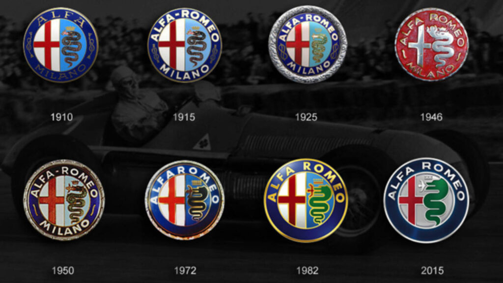
Let’s walk through the key changes in the logo’s evolution over the years:

1910: The First Logo
The Alfa Romeo brand was founded on June 24, 1910, in Milan, Italy. To mark the brand’s origins, the Milan municipality cross and the Visconti serpent were chosen as key elements of the logo. The circular badge also featured the inscription “ALFA-MILANO” with two decorative ropes, believed to be Savoy-dynasty knots.
1915: The Romeo Addition
In 1915, when Nicola Romeo took over the company, his surname was added to the logo. The new design read “Alfa-Romeo Milano”, with the rest of the elements remaining unchanged. This update also refined the logo’s colours, giving it a more modern and bold look. The serpent and cross became more defined, and the blue colours became deeper and sleeker.
1925: The Silver Wreath
By 1925, the Alfa Romeo logo became more complex. A silver-leaf wreath surrounded the logo, giving it a refined, luxurious appearance. Additionally, the ropes were simplified, and the wordmark now featured “Alfa Romeo Milano” in a new font.
1933: The Gold Wreath
In 1933, the logo underwent another significant change. The silver wreath was replaced by a gold wreath, and the wordmark was enlarged. The cross became more prominent, and the snake became bolder, reinforcing the brand’s growing stature.
1946-1947: Simplification and Colour Update
After WWII, the Alfa Romeo logo underwent several simplifications:
- The silver wreath was replaced by a simple silver circle.
- The Savoy knots were removed, and two wavy lines were added in their place.
- In 1947, the colour palette shifted to red and yellow, and the logo received a golden frame.
1948: Return to Classic Colours
In 1948, the logo returned to its original colour scheme with green for the snake, red for the cross, and yellow for the background. The green serpent gained a thicker black outline, and the human figure in the snake’s mouth was coloured red, making the design bolder and more impactful.
1950: A Geometric Update
By 1950, the logo became rounder and more geometric. The serpent grew in size and became more dynamic, while the human figure became more stylised. The wordmark was resized, with “Alfa Romeo” being more prominent than “Milano”, and the font became lightweight and modern. This version of the logo remained in use for nearly 20 years.
1971: Returning to Simplicity
In 1971, many of the earlier elements of the Alfa Romeo logo were reintroduced but with a simpler design:
- The “Milano” part of the wordmark was removed.
- The logo took on a golden tone, and the snake and cross were simplified.
This version of the logo reflected elegance with minimal detail.
1972: Bright Yellow Hues
In 1972, the yellow colour of the logo was brightened, giving it a fresh, modern feel. The blue disc became darker, and the outlines of the snake, cross, and the human figure were all updated to match the new yellow hues, providing a stronger contrast.
2000: Clearer, Bolder Design

By the 2000s, the Alfa Romeo logo became clearer and more dynamic. Gradient shades were added to the background, and the serpent crown became more refined. The design was made to stand out in the modern automotive world.
2015-Present: The Final Refinement
The 2015 update was the final change to the logo:
- The gold elements were replaced with silver.
- The cross and serpent were no longer divided into two segments but rather shared a common silver background.
- The design became cleaner and more unified.
What Is The Meaning Of Alfa Romeo Logo?
Every element in the Alfa Romeo logo carries deep symbolism:
- The cross represents Milan, Alfa Romeo’s hometown, and is connected to St Ambrose’s or St George’s cross.
- The Visconti serpent (Biscione) is a symbol of the Visconti family, rulers of Milan in the 11th century. The serpent is depicted eating a human—often interpreted as a symbol of victory in the Crusades.
The Alfa Romeo logo is a remarkable symbol that reflects both heritage and luxury. From the Visconti serpent to the Milan cross, each design element tells a unique story of Italian pride, victory, and craftsmanship. Today, the logo still represents high-performance sports cars that capture the world’s attention.
FAQs
What does the Alfa Romeo logo represent?
The logo combines Milan’s red cross and the Visconti serpent, symbolising the brand’s heritage and connection to Milan’s noble history.
Who designed the original Alfa Romeo logo?
Young illustrator Romano Cattaneo designed the first logo in 1910, inspired by the Visconti serpent on Milan’s Castello Sforzesco.
What is the meaning of the Visconti serpent?
The green serpent, or “Biscione,” represents the Visconti family, rulers of Milan in the 14th century, and is depicted devouring a human figure.
Has the Alfa Romeo logo changed over time?
Yes, the logo has evolved since 1910, with changes in colour, design elements, and the removal of “Milano” in 1972.
What is the Quadrifoglio symbol?
The Quadrifoglio, a green four-leaf clover, first appeared in 1923 on Ugo Sivocci’s car and now denotes Alfa Romeo’s high-performance models.
Find the best Alfa Romeo cars for sale in the UAE.
Stay tuned to UAE’s most popular auto blog for more information about the latest happenings in all of the Emirates.
Alfa Romeo, a legendary Italian car brand, is known for high-performance, luxury sports cars. As part of the Stellantis group, Alfa Romeo combines Italian craftsmanship with thrilling speed. However, alongside its cars, the Alfa Romeo logo has become a symbol


