Ferrari is one of the most famous names in the world of sports cars. Known for luxury, speed, and Italian craftsmanship, Ferrari also has one of the most recognisable logos in the auto industry.
At the heart of this logo is the legendary prancing horse, a symbol that has remained with the brand for over a century. In this article, we explore the story, design, and evolution of the Ferrari logo.
Ferrari Logo Overview
While many car brands update their logos every few years to stay modern or stand out, Ferrari has done the opposite. Instead of chasing trends, Ferrari has kept its iconic prancing horse design nearly unchanged.
This approach has strengthened the brand’s identity over time, making its logo a mark of heritage and trust.
Origin of the Ferrari Logo
The story of the Ferrari logo begins with Enzo Ferrari, the brand’s founder. In 1923, after a race win at Spa 24 Hours, Enzo met the parents of Francesco Baracca, a famed Italian WWI pilot. Baracca had a black prancing horse painted on his fighter plane for good luck.
Baracca’s parents encouraged Enzo to adopt the horse symbol. He agreed, and the yellow shield was later added to represent Enzo’s hometown, Modena. The logo was officially introduced with the Ferrari 125S — the brand’s first car.
From that moment, the prancing horse became a part of every Ferrari vehicle.
Ferrari Logo Today
The current Ferrari logo is a bold, stylised emblem. It features a black horse rearing on its hind legs, set against a bright yellow rectangular background. Above the horse, the red, white, and green stripes of the Italian flag add a patriotic touch.
The word “Ferrari” sits below the horse in a sleek, modern font. This design is simple yet powerful, representing everything Ferrari stands for: speed, performance, luxury, and pride.
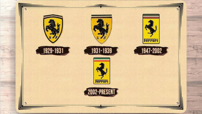
How Has The Ferrari Logo Evolved Over The Years?

1932–1939: First Appearance at Spa Grand Prix
Ferrari’s original logo debuted at the 1932 Spa Grand Prix. It featured:
- A yellow shield
- A black prancing horse
- The letters “S” and “F” for Scuderia Ferrari
- Italian flag stripes at the top
This was the first time the horse became a public symbol for Ferrari. It stayed closely tied to Ferrari’s racing identity.
1947–2002: A Brighter, Bolder Look
In 1947, Ferrari made several changes:
- Brighter colours replaced the older, duller tones
- The background shape changed from a shield to a rounded rectangle
- The “SF” letters were removed
- The logo began appearing widely on production cars
The updated version retained all key elements but appeared more refined and visually appealing.
2002–Present: A Sleek, Elegant Finish
The next update came in 2002. This version is still in use today, with small changes:
- The flag stripes lost the black dividing lines
- The shape and edges were polished
- The logo got a more elegant and modern finish
Though the changes were subtle, they made the design cleaner and perfect for Ferrari’s growing global image.
The Ferrari Symbol
The horse in the logo isn’t just decorative. It holds real meaning:
- Power
- Victory
- Speed
Often, you’ll see a silver version of the horse on Ferrari car bonnets and side mirrors. The pose—on two legs—shows readiness and force.
The Ferrari Emblem
Today’s emblem is a direct evolution of the 1947 design. It appears on the car’s front grille, hood, and rear badge, and instantly tells the world: this is a Ferrari.
Ferrari Logo Meaning
Every part of the Ferrari logo carries meaning:
- The prancing horse, inspired by Francesco Baracca’s fighter plane, represents strength and agility
- The black colour, symbol of mourning for Baracca
- The yellow background, tribute to Modena, Enzo Ferrari’s hometown
- The Italian flag reflects national pride
Together, these elements build a logo that’s as meaningful as it is iconic.
Ferrari Logo Colours
Each colour on the Ferrari badge has a purpose:
- Black horse – Prestige, power, and a link to heritage
- Yellow background – Joy, energy, and homage to Modena
- Red, white, and green stripes – National pride of Italy
The strong contrast between colours ensures the Ferrari logo remains distinctive and unforgettable.
Ferrari’s logo is more than a brand symbol—it’s a legacy. While other car makers refresh their logos often, Ferrari has chosen consistency over change.
The prancing horse remains a timeless icon in 2025, representing Ferrari’s continued dominance in luxury, motorsport, and design.
Find the best Ferrari cars for sale in the UAE.
Stay tuned to UAE’s most popular auto blog for more information about the latest happenings in all of the Emirates.
Also Read:
Ferrari is one of the most famous names in the world of sports cars. Known for luxury, speed, and Italian craftsmanship, Ferrari also has one of the most recognisable logos in the auto industry. At the heart of this logo


